UX / UI PORTFOLIO

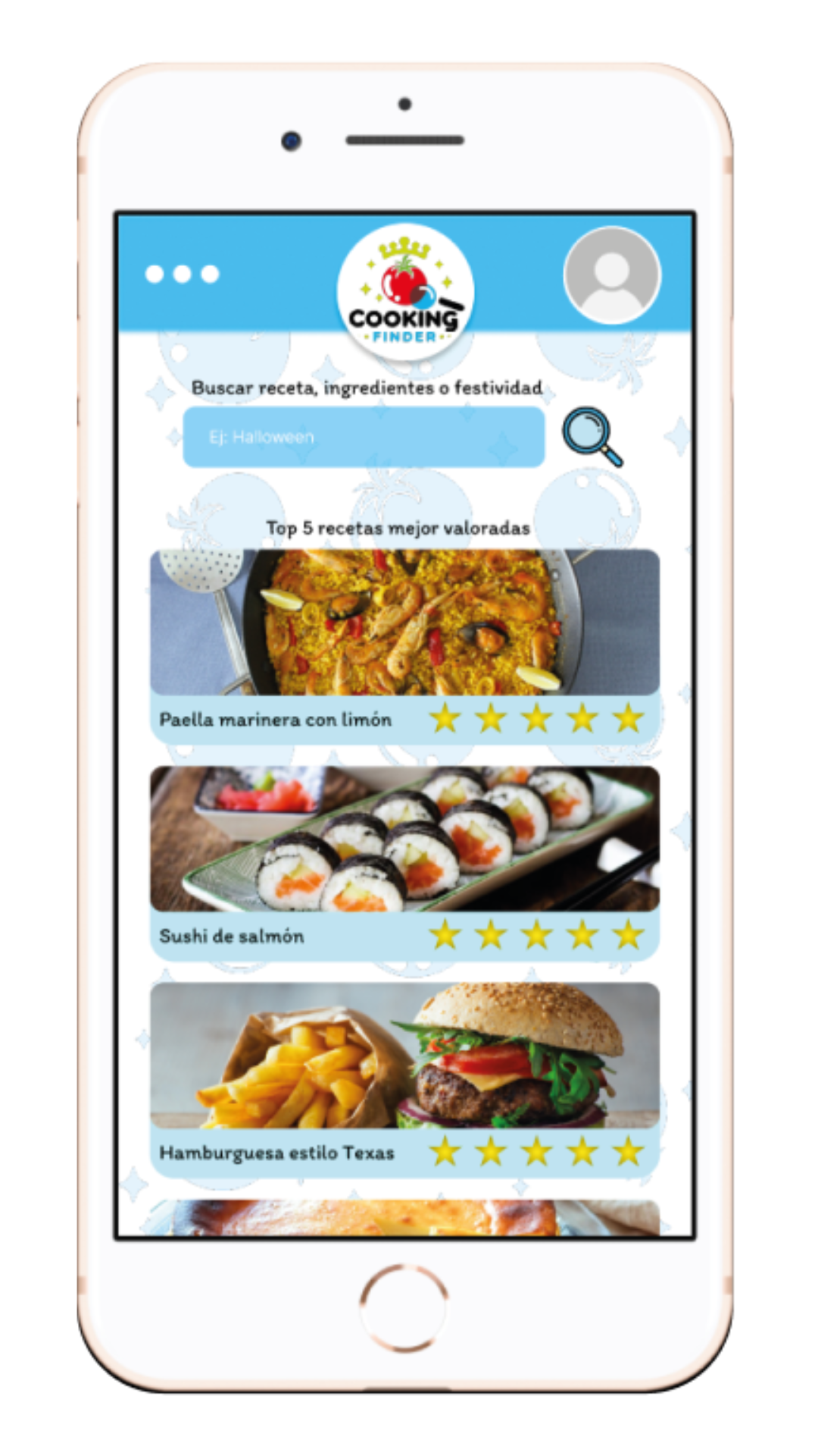
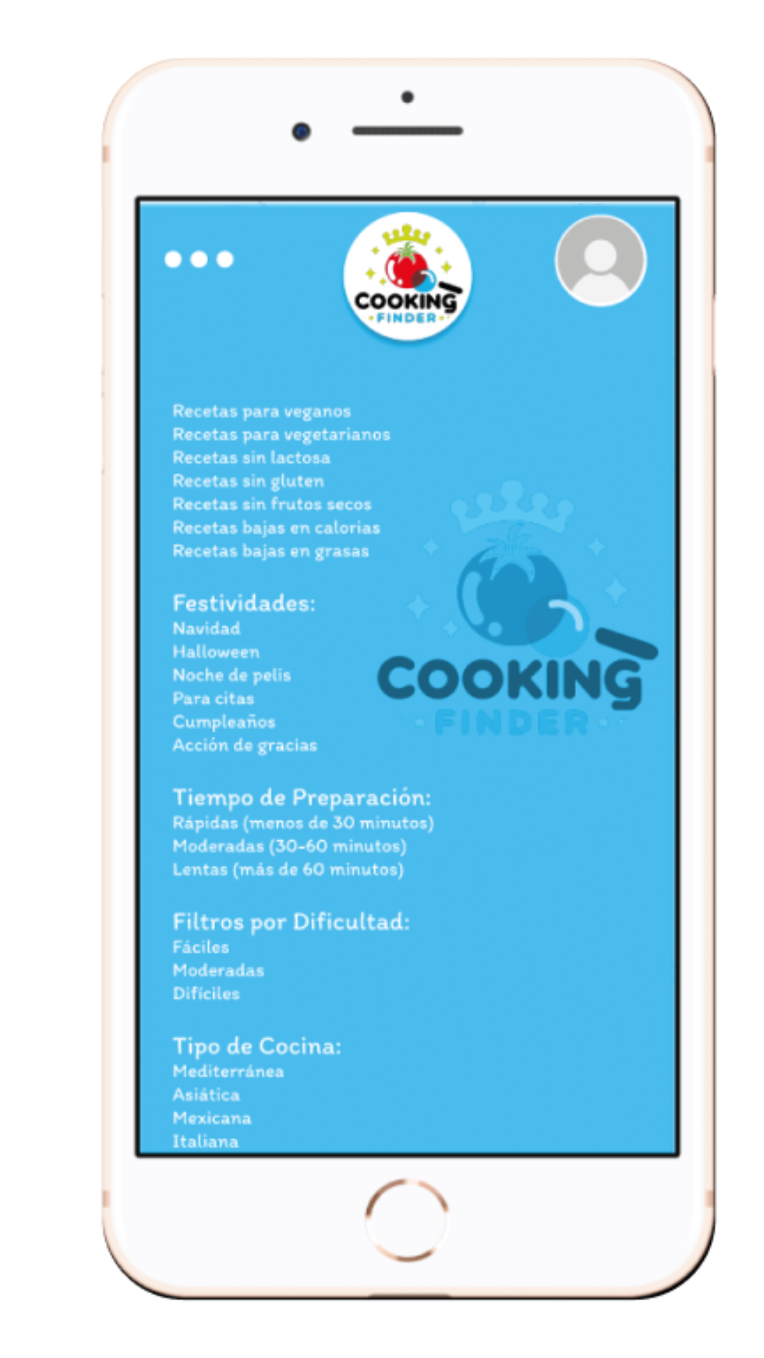
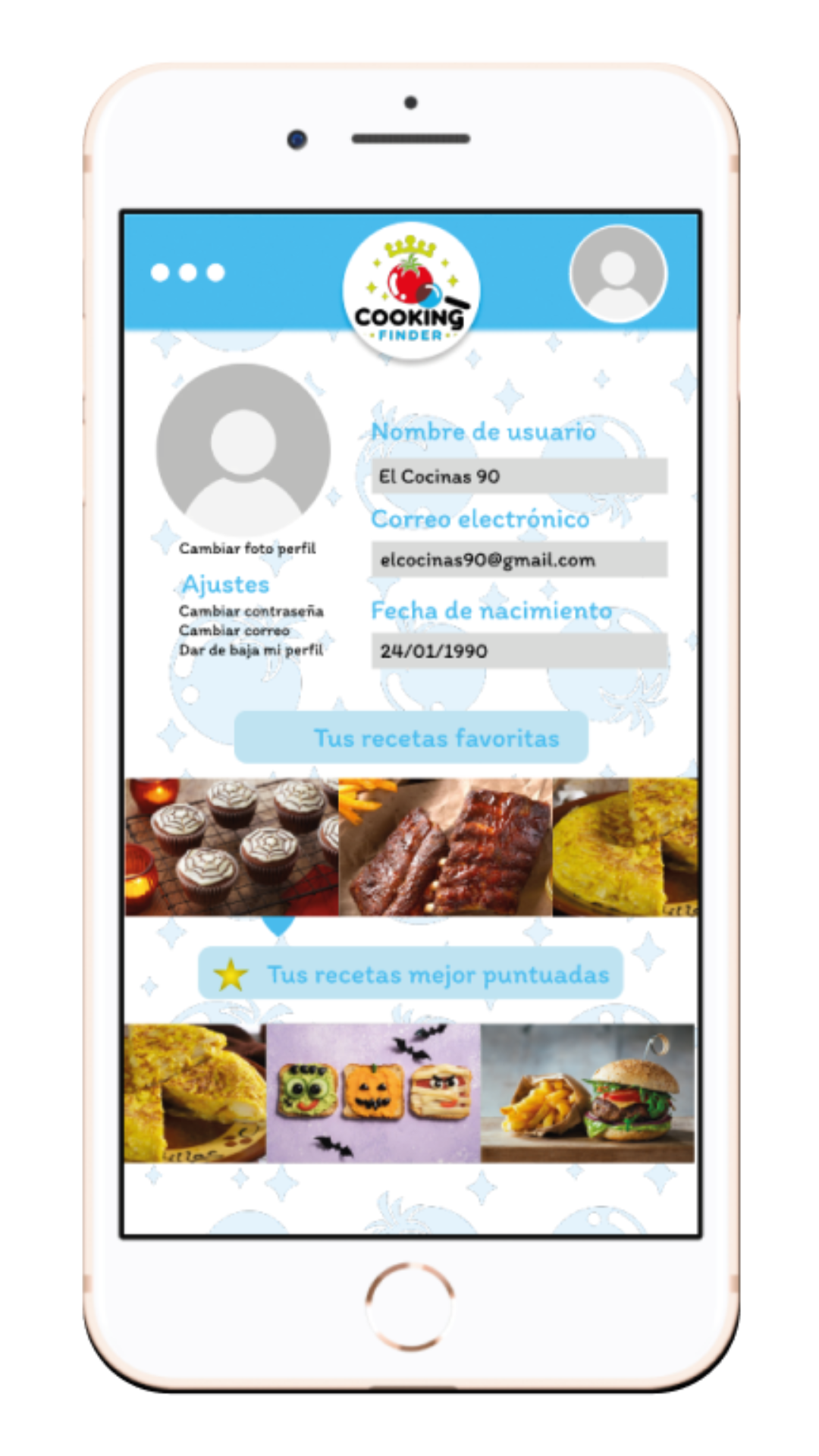
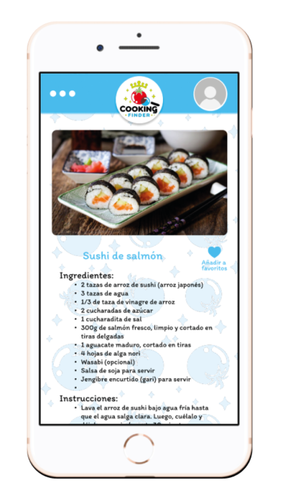
Prototype Cooking Finder

Logo

The logo for Cooking Finder was designed in Illustrator to reflect the essence of the app:

  • Simplicity: A minimalist design that is easy to recognize and remember.
  • Graphic Representation: Elements that evoke cooking and searching, such as a magnifying glass and kitchen utensils.
  • Versatility: An adaptable logo that works well across various platforms and sizes.

Project description

Cooking Finder is an innovative application designed to facilitate recipe search and meal planning. It helps users find recipes based on the ingredients they have available, their dietary preferences, and their preparation time.

Interface design

The interface design of Cooking Finder focuses on usability and modern aesthetics. My main goals were:

  • Simplicity and Elegance: Create a clean and intuitive interface that allows users to navigate effortlessly.
  • Accessibility: Ensure the app is easy to use for people of all ages and abilities.
  • Visual Appeal: Use vibrant colors and attractive graphics to enhance the user experience.

User interaction

For user interaction, I focused on:

  • Smooth and Natural Flow: Design smooth transitions and animations that enhance the user experience.
  • Instant Feedback: Provide immediate responses to user actions to improve the sense of control and satisfaction.
  • Intuitive Navigation: Ensure that navigation paths are clear and users can easily find what they are looking for.

Outcome

The Cooking Finder prototype is a combination of functional and attractive design, aimed at enhancing the culinary experience for users. I am proud of this project and excited about the possibility of further development.
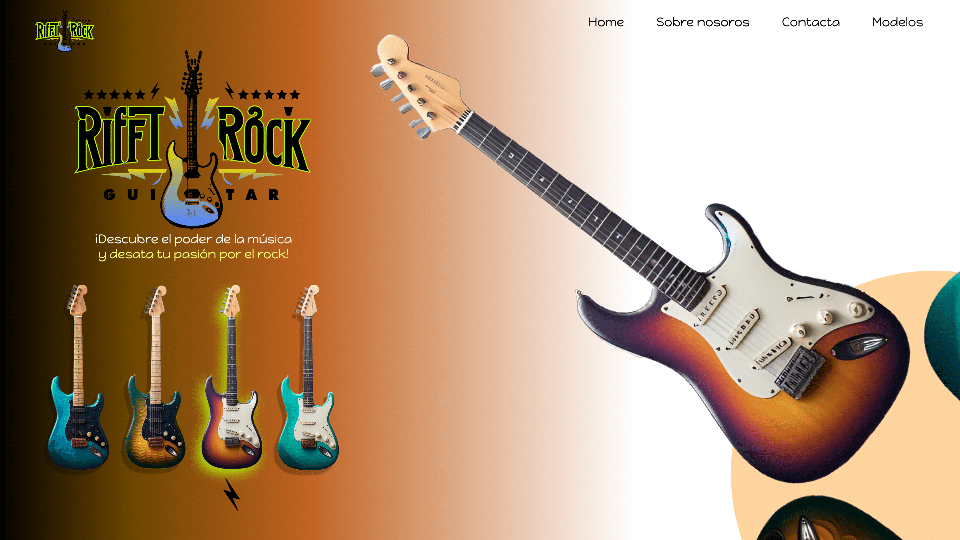
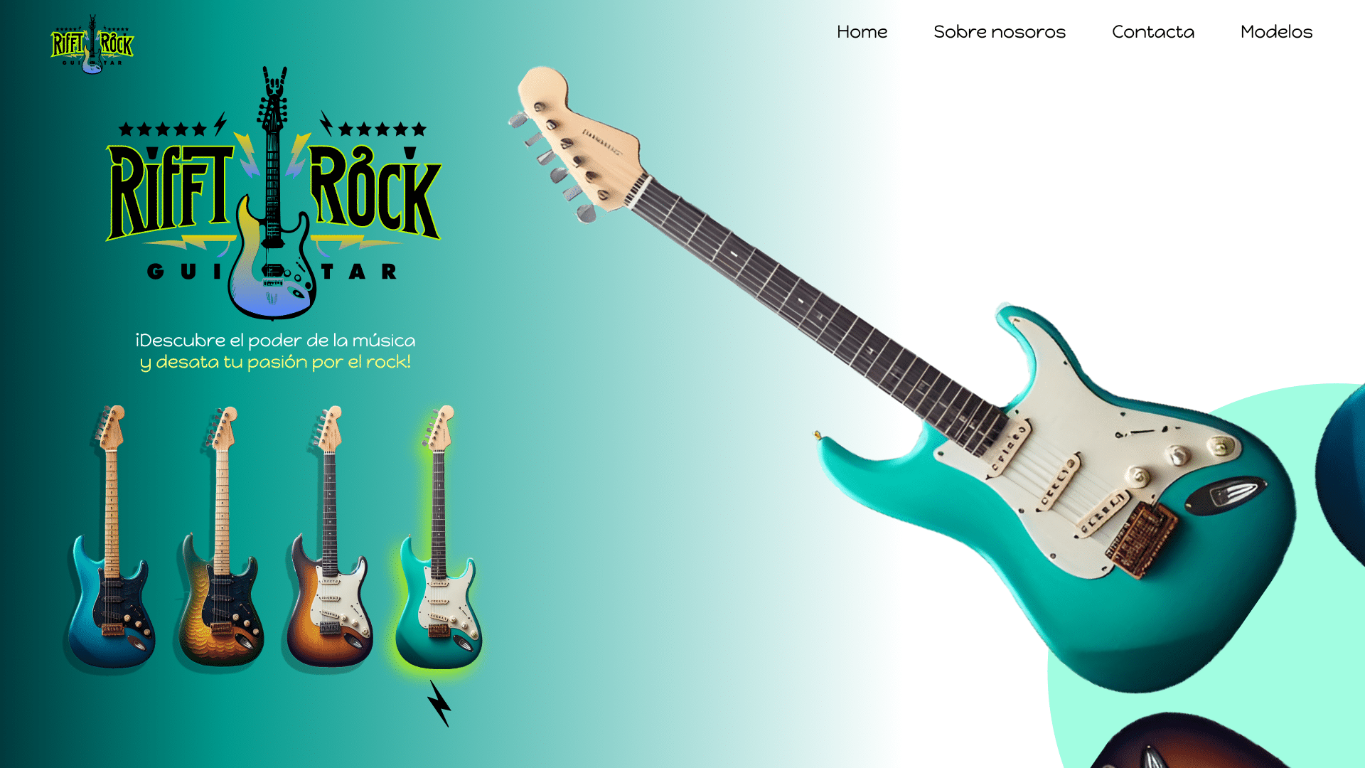
Rift Rock Hover effect

Logo

The logo for Rift Rock was designed to encapsulate the brand’s rock ethos:
  • Bold and Edgy: A design that conveys strength and a rebellious spirit, resonating with the rock genre.
  • Memorable and Versatile: A logo that is easy to recognize and works well in various formats and applications.
  • Stylized Elements: Incorporating elements that evoke the energy and dynamism of rock music.
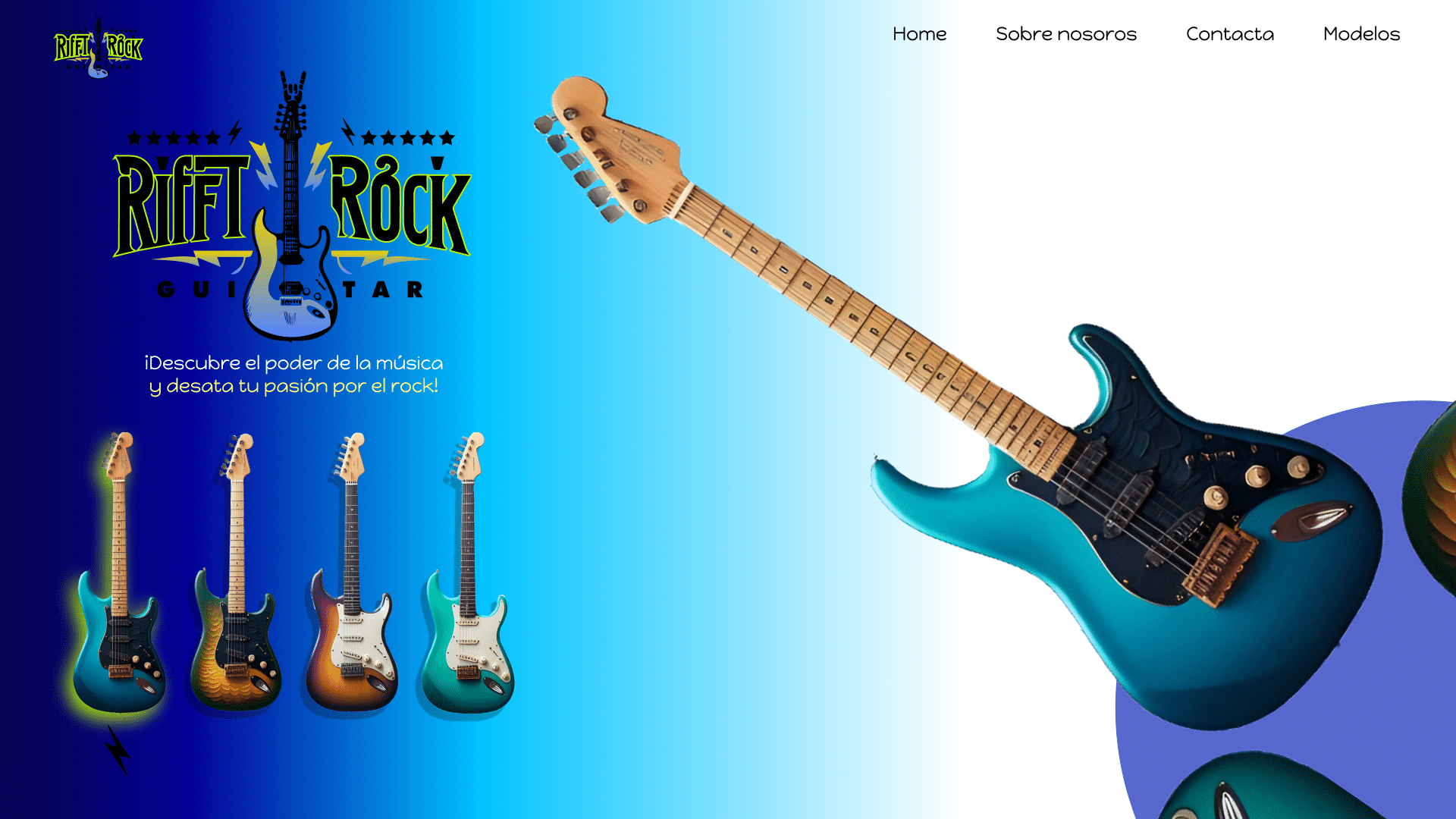
Rift Rock, a concept for a guitar brand website. This project showcases my work in creating an interactive image prototype, focused on interface design, user interaction, and logo creation.

Project description

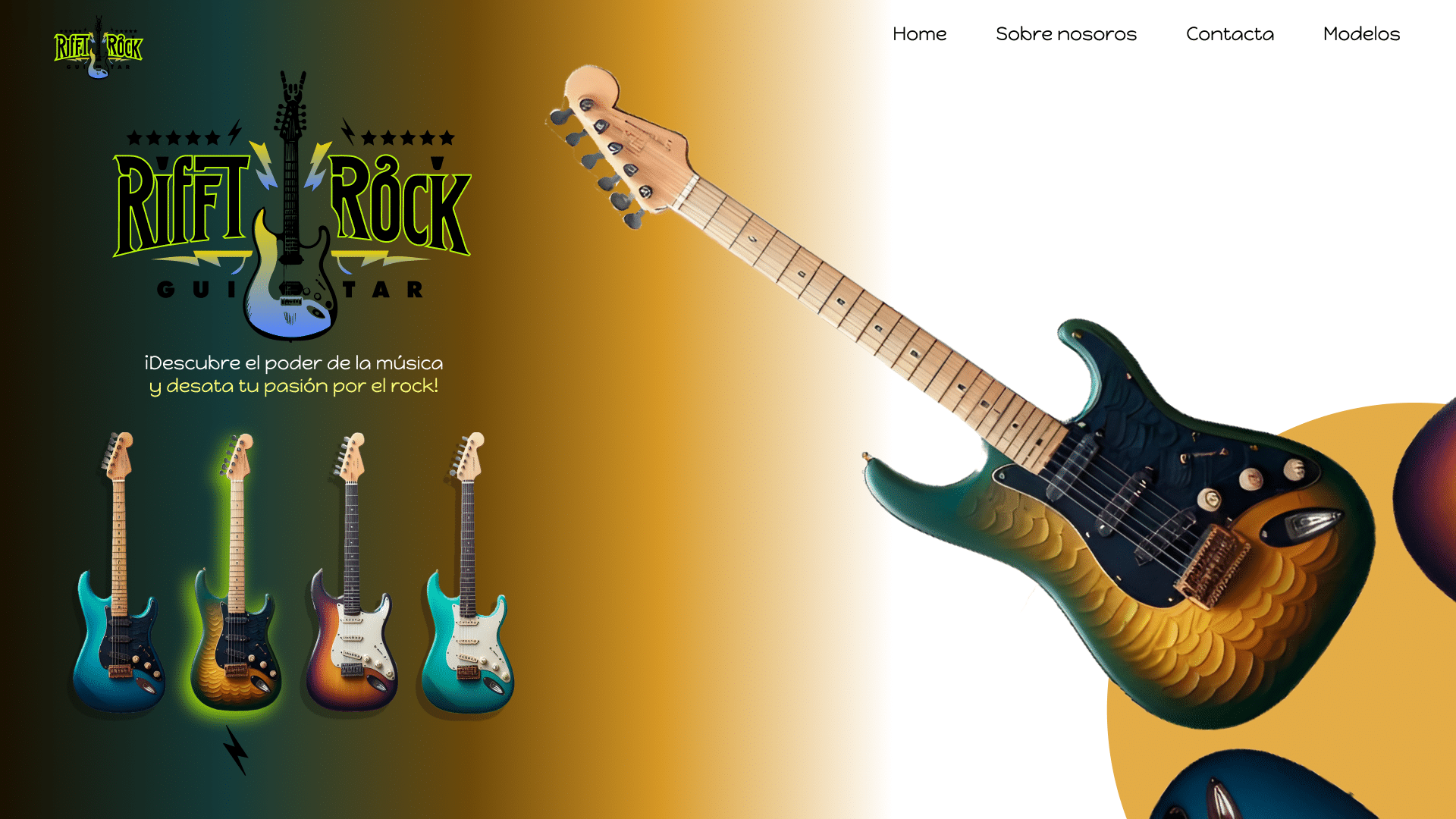
Rift Rock is a brand dedicated to providing high-quality guitars. For this project, I designed an interactive image for a potential website, where users can hover over guitar models to see real-time color changes, enhancing the selection process and making it more engaging.
Interface design

The interface design for the Rift Rock image prototype focuses on creating a visually appealing and user-friendly concept. My main goals were:
  • Simplicity and Sophistication: Develop a clean, modern visual that reflects the premium quality of the guitars.
  • User-Centric Design: Ensure that the interactive elements are intuitive and easy to use.
  • Visual Impact: Utilize bold, striking visuals to capture the essence of rock music and the brand’s identity.

User interaction

For the user interaction component, I concentrated on:
  • Hover Effect for Color Selection: Designed an image where users can hover over guitar models to see real-time color changes, making the customization process intuitive and engaging.
  • Seamless Experience: Ensure smooth transitions and visual feedback within the image to enhance the overall user experience.

Outcome

The Rift Rock image prototype combines functional design with an engaging user experience, aimed at enhancing the guitar selection process for customers. I am proud of this prototype and excited about the potential for further development.

Frapé Parallax effect

User interaction

For user interaction, the focus is on:
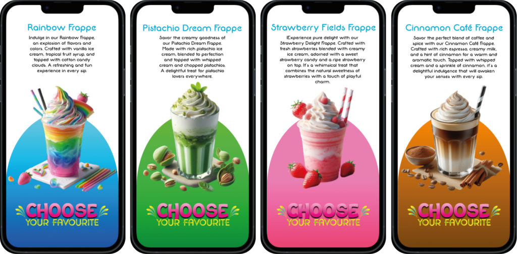
  • Sliding Flavor Selection: Enable users to slide left or right to switch between frappé flavors, with the visual elements dynamically resizing to maintain a smooth and immersive experience.
  • Enhanced Visual Feedback: Incorporate animations and transitions that provide clear visual feedback when selecting different flavors, enhancing user satisfaction and interaction.
  • Responsive and Accessible: Ensure the prototype is responsive across various devices and accessible to all users, regardless of their preferred interaction method.

Logo design

The logo for Frappé Fusion complements the brand’s essence of creativity and refreshment:
  • Distinctive Branding: Develop a logo that captures the essence of each frappé flavor, integrating seamlessly into the overall visual identity of the prototype.
Frappé Fusion, a web prototype featuring a dynamic parallax effect that allows users to explore four different flavors of frappés. This project highlights my expertise in interface design, user interaction, and innovative visual effects, including logo design.

Project description

Frappé Fusion is a concept aimed at presenting four distinct flavors of frappés through an engaging and interactive web experience. The prototype incorporates a unique parallax effect where sliding left or right changes the displayed flavor, dynamically resizing the current and incoming frappé images.

Interface design

The interface design for Frappé Fusion is crafted to enhance user engagement and enjoyment:
  • Dynamic Parallax Effect: Implement a responsive parallax effect where sliding gestures smoothly transition between frappé flavors, with the current flavor shrinking and the selected flavor enlarging.
  • Visually Stimulating: Utilize vibrant colors and high-resolution imagery to showcase each frappé flavor, ensuring they stand out and appeal to the user’s senses.
  • Intuitive Navigation: Design intuitive navigation controls that guide users seamlessly through the flavor selection process.

Outcome

The Frappé Fusion web prototype combines innovative design with interactive elements, offering users a delightful journey through the world of frappés. I am proud of this project and excited about its potential for further development and refinement.

Frutopia: Parallax effect

Logo & design elements

The logo and design elements for Frutopia were crafted to reflect the brand’s fresh and playful identity:
  • Logo Design: A modern and vibrant logo that embodies the essence of fresh fruits and excitement.
  • Innovative Visual Effects: Leveraged AI for design elements and used advanced techniques to ensure a visually appealing and cohesive brand representation.

Outcome

The Frutopia web prototype combines creativity with advanced interactive design, offering users a delightful exploration of flavors and visual elements. I am proud of this project and enthusiastic about its potential for further development.
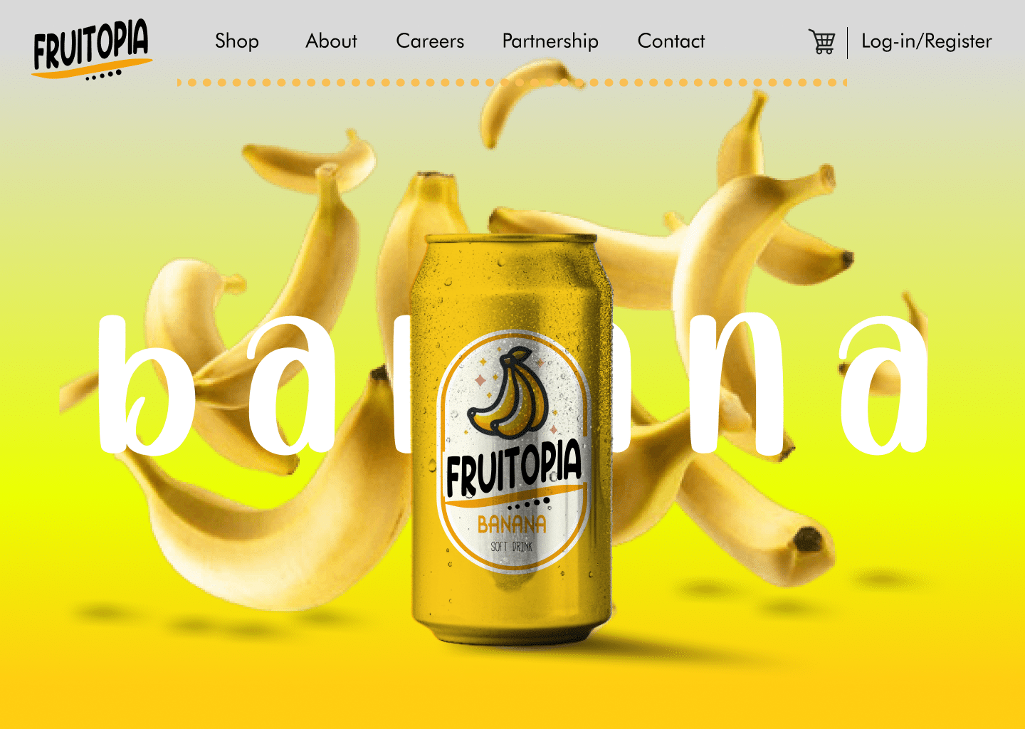
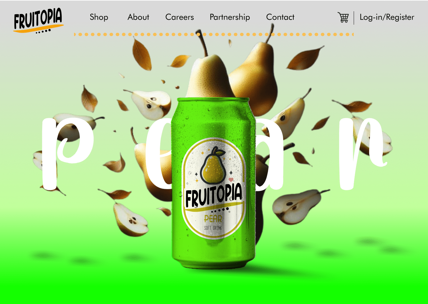
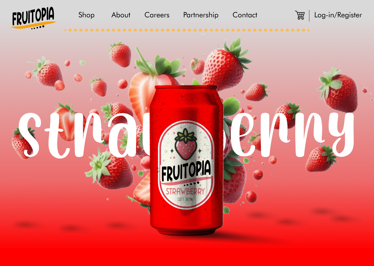
Frutopia, a web prototype featuring a dynamic parallax effect showcasing a soda can with three flavors that rotate alongside the cursor or touch, changing flavors as the can rotates. This project highlights my skills in interface design, user interaction, and branding, including logo creation and innovative visual effects.

Project description

Frutopia is an imaginative concept showcasing a soda can with three refreshing fruit flavors. The web prototype incorporates a captivating parallax effect where users interact with the can, causing it to rotate and change flavors. Additionally, fruits cascade from the top or appear dynamically, enhancing the sensory experience.

Interface design

The interface design for Frutopia is designed to captivate and engage users:
  • Interactive Parallax Effect: Implement a dynamic parallax effect where the soda can rotates based on user interaction, providing a playful and immersive experience.
  • Vibrant Visuals: Utilize high-definition graphics and animations to showcase the colorful soda can and the cascading fruits, creating a visually stimulating environment.
  • User-Centric Approach: Ensure intuitive navigation and seamless transitions to enhance user exploration and interaction.

User interaction

For user interaction, I focused on:
  • Rotating Can with Flavor Change: Enable users to rotate the soda can by moving the cursor or finger, triggering a flavor change with each rotation.
  • Dynamic Fruit Animations: Incorporate animations where fruits fall from above or appear dynamically around the can, adding a whimsical touch to the experience.
  • Responsive Design: Ensure optimal performance and visual fidelity across various devices and screen sizes.

Ready to conquer the design world together?